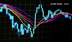
A price chart combines all the buy and sell trades going on in a specific period of time. Depending on the chart, they can contain data from public news events and the expectations of other traders. When new events hit the wire and differ from expectations, prices shift. Traders can make sense of these changes without understanding what brought them about. This is the magic of modern technical analysis 💫
In this article, we discuss the different types of Forex charts and how to read them. Learning how to read Forex charts will help you progress greatly in your trading journey and prepare you for the more complex concepts lying ahead.
Contents:
- Why do we need price charts?
- How to read Forex charts
- What does a price chart show?
- Customizing your chart
- Charting a course for success
Interact with the underlined words and green dots to get additional details and explanations.
Why do we need price charts?
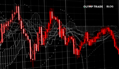
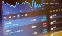
To understand patterns and make sense of all the chaos in the financial markets, we need a way to visualize and interpret what’s going on. In trading, we use a price chart to analyze the historical and current behavior of traders. It is actually the very first tool that traders see in their career — a naked price chart. A chart is a visual representation of a financial asset’s price over a set period of time. At a glance, you can see the trading activity that took place within a specific time period. Hence, it is crucial to know how to understand Forex charts.
How to read Forex charts
Most of the time, price changes can seem random. It’s our job as traders to make sense of these movements, manage risk and assess probability before placing trades.
When looking at a chart with a specific time period, we can begin to make sense of price action. The time period is shown on the horizontal x-axis, while the price changes are set out on the y-axis. The newest price is always the farthest right on the graph.
The time period is also referred to as a timeframe in trading. On Olymp Trade, timeframes are represented as the individual bars or candles in bar, candlestick and Heiken-Ashi charts, and can range from five seconds to one month. Besides choosing the timeframe, traders can choose how to visualize each timeframe.
Currently, the four most common types of price charts are:
- Lines
- Bars
- Candlesticks
- Heiken-Ashi
Line graph
A line graph, or Area chart on Olymp Trade, is a very simple interpretation of where the price is during a specific timeframe.
This chart is easy to understand because it is composed of one line. The line is drawn along a series of points referring to a certain type of price behavior, such as closing prices, within a certain timeframe while hiding all others, such as opening price, highest price and lowest price. However, due to the fact that it only shows one kind of price behavior at a time, it may not provide enough information to make an informed decision 🙅
Reading a line graph will help you to easily visualize trends and get a big-picture read of the asset’s price movements ⬇️

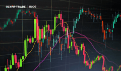
Bars and candlesticks
Bars and Japanese candlesticks are the most commonly used price charts.
They both show the following information per timeframe:
- Opening price
- Closing price
- Highest price
- Lowest price

These types of charts help traders visualize the price range for any given timeframe. All the highs and lows that the price was at during the timeframe are shown. As volatility increases, the size of the bar or candlestick increases. When the market becomes quiet or the trend fades, the size of the bar or candlestick decreases ⬇️
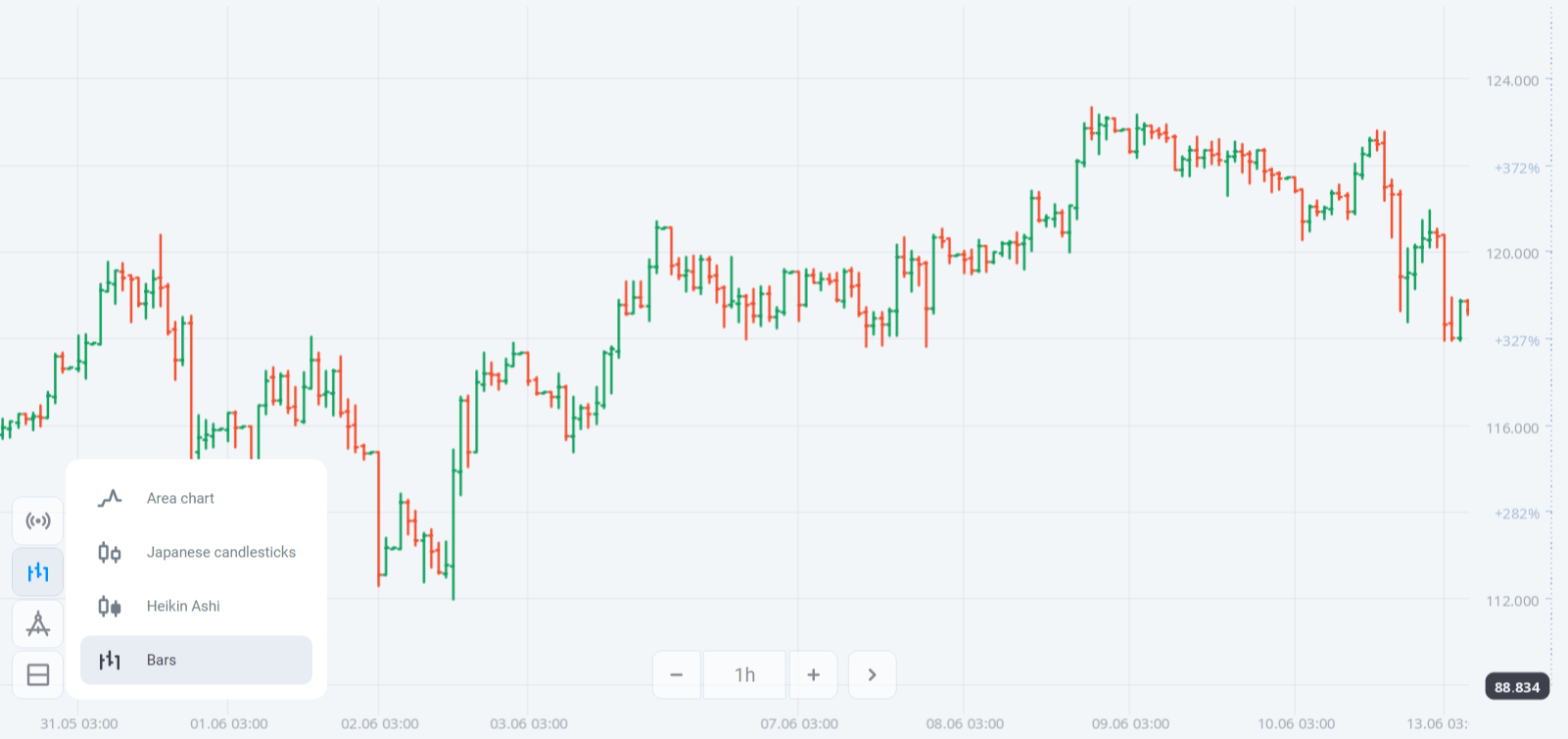
Bars and Japanese candlesticks show exactly the same information. The only difference is how the opening, closing, highest and lowest prices are visually represented ⬇️

Both of these types of charts can be used to make sense of pricing data for any asset class, whether it be:
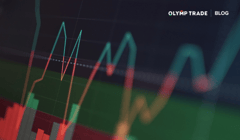
Heiken-Ashi
Heiken-Ashi is the most complicated chart in popular use because it hides certain data in order to give the trader a better understanding of trend direction and inertia.
Visually, it looks like a candlestick chart and is often mistaken for one. In fact, Heiken-Ashi transforms Japanese candlesticks and smooths out price fluctuations. This indicator helps you not only see the direction of a price trend but also its reversal point ⬇️

What does a price chart show?
The main information that we can gather from a graph is changes in price. This change occurs when supply and demand change. The most impactful events to the conditions of supply and demand include monetary policy changes from a central bank, large trades from “smart money” investors, economic booms and busts, and different force-majeure events around the planet. Graphs include all this information and the activity of all market participants trading the asset.
You can use candlesticks to pinpoint chart patterns like Shooting Stars, Doji Candles and Head-and-Shoulders. These are powerful visual aids to help you quickly make decisions based on the effect that market participants are having on the asset price.
You can also use a chart together with indicators such as Pivot Point, Inversion Bollinger and Fibonacci to easily identify market turning points. Trend reversals are some of the best entry points when trading short term.
Keep it simple and don’t overload your screen with too much data. It’s important to have sufficient information, but not so much that you have difficulties with making decisions.
Customizing your chart
On Olymp Trade, you can color your charts using the different themes available in the Market. You can change the color of your graph in Options as well as the type of graph by clicking on the Chart Types button above the Indicators button. If you cannot see the button, make sure it’s enabled through the Options menu.

Charting a course for success
Each chart type has its own advantages and disadvantages. The advantages of using candlesticks or bars is that they are easy to read and they provide a wealth of information about price action. They are a powerful tool, and your eyes will start to pick up subtle clues as you progress in your trading career. Use and study them to aid you in your trading.
The combination of indicators and charts you’ll end up using will be unique to you as a trader. Your preferences will be decided not only by which tools work best for you, but also your trade outcomes. It’s wise to start with the basics and slowly work your way up to implementing different technical analysis techniques in your trading.
Now that you know how to read Forex charts, check out our article on the best Forex trading tools if you’re still developing your trading strategy. Join the Olymp Trade family today and trade on a platform that’s tailored to supporting your success!
Go to Olymp TradeRisk warning: The contents of this article do not constitute investment advice, and you bear sole responsibility for your trading activity and/or trading results.