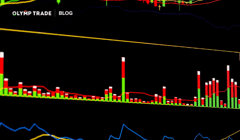
While the Kagi chart is less known than the commonly accepted chart types, it filters out the market noise and helps traders understand price movements more easily. Also, it indicates potentially favorable market entry points, effectively serving as a trade signal generation tool.
Interact with the dashed blue word and green spot on images to get additional details and explanations.
Contents
Kagi Indicator Usefulness
Instead of time, a Kagi chart is trend-sensitive. The Kagi graph is a way to reflect the price movement. In this sense, it is fundamentally similar to Japanese candlesticks, area, Heiken Ashi, or bar.
Kagi’s peculiarity is that it doesn't have the time axis because it doesn’t reference the time periods. Instead, it reflects the changes in the price dynamics against its previous performance.
Common chart types would show you a new candlestick for every period you’ve chosen as your time frame. However, it doesn’t reflect how all presented candlesticks are related if they are, or how they fall into trends if they do.
Identifying trends and trend reversals is the core of chart reading that guides your trading decisions, which is all left to your interpretation in the case of common chart types. Many traders find this process troublesome and time-consuming. That’s why they seek additional indicators to better understand that price performance.
In contrast, the Kagi chart makes it all much simpler.
Instead of time, a Kagi chart is trend-sensitive. It presents the price moves that are impactful in the context of the previous price performance. By doing so, it readily shows you the price dynamics that you’d otherwise need to understand with common chart types. This saves time and energy and facilitates a better reading of the price movement.
Examples of Kagi Chart Reading
In-trend Reversals
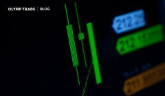
One Vertical Line, No Change

As you can see, it is just one vertical line. This line would be extended downwards every time the price on the right closes lower than the previous closure.
For example, instead of having three consecutive bearish candles on the right, you’d see your vertical line extended down three times on the left.
Two Key Inputs, Three Scenarios
The period in which the Kagi mechanism checks the price behavior every time is the input you set when configuring the Kagi chart. In this sense, it is similar to the time frame with the common chart types.
If the price reverses, the Kagi mechanism checks whether it closes more than a certain percentage against the previous period’s close. This percentage is another key input with the Kagi chart.
Therefore, if the reversal is more than that percentage, you’ll have a new vertical line connected to the previous one by a horizontal arm. If it is less, the line stays unchanged.
Therefore we have three scenarios of Kagi chart building
- The vertical gets extended each time the price moves in the same direction and surpasses the preset percentage.
- The vertical line stays unchanged if the new period’s price moves in or against the previous one below the preset percentage.
- A new vertical line gets formed if the price reverses and closes more than the preset percentage against the previous period’s direction.
New Vertical Line
On the right hand candlestick chart, the last bullish candlestick closed more than the required percentage higher than the previous candle’s closure. On the left hand Kagi chart, it was reflected by a new vertical line. This is how the in-trend reversal is shown by the Kagi graph.

Trend Reversals
Large trend changes may be reflected on the Kagi chart by a different thickness of the line.

A variation of Kagi charts uses colors instead of line thickness to indicate trend reversals. Whenever there is a change in the line thickness, there is a trend reversal. Such a point is normally taken as a favorable market entry signal.
In the picture below, you can see downward trends in red and upward trends in green. Correspondingly, the color-changing points are the suggested market entry signals.

The Best Way to Approach the Market
The Kagi chart is an unconventional tool, but we have learned that it can help traders better understand the price dynamics of trading instruments or, at the very least, provide an interesting alternative to the common chart types.
Ultimately, the best way to approach the market is to combine various charts and trading strategies while finding those that serve you best. In the meantime, expanding your knowledge about technical analysis tools and the market is always a worthy time investment.
Olymp Trade’s aim is to create a productive learning environment that helps you reach all your goals. The Kagi chart is just one of the many tools to learn about, and the Olymp Trade blog is happy to provide you with comprehensive knowledge about them.
You can find a large array of educational materials in the Help section located on the Olymp Trade platform as well.
Help SectionRisk warning: The content of the article does not constitute investment advice and you are solely responsible for your trading activity and/or trading results.